

You don’t have to reinvent the wheel with a mobile website design, but it is just as important for your mobile site to look as good as, and be as functional as, your desktop version.
To help inspire some design ideas, we’ve put together a list of 5 amazing examples of mobile-friendly websites that we are impressed with.
Etsy
If you’re not familiar with Etsy, it’s an online marketplace for independent sellers. I basically spent my entire wedding budget on this website alone and can lose hours endlessly browsing the unique and creative crafts that its users sell.
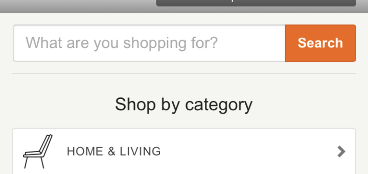
As you can see from the screenshot below, their mobile site gets right to the point: “What are you shopping for?”, or, if you don’t know what you want and have a few spare hours to spend, you can browse via their “shop by category” section.
.png?t=1540529877862&width=320&name=Etsy%20Mobile%20Site%20(1).png)
Scroll down a bit further, and your browsing gets even easier. You can search for trending gifts, like the upcoming Valentine’s Day, or within certain monetary filters, like “under $30” or “under $50”. As you can see, all of these filter options come with clear and relevant thumbnail images, and the buttons are all big enough to easily view and click through with their finger.
.png?t=1540529877862&width=320&name=Etsy%20Mobile%20Site%20(3).png)
Etsy has done a great job in building a sleek, yet whimsical looking website — similar to most of the products sold within the site — while keeping it very functional as well. Not only is it super easy to browse a large volume of pages on the mobile site, but making a purchase is a flawless process, as is contacting a vendor, looking into your purchase status, or reviewing a past order.
Airbnb
Airbnb is another type of online marketplace, but this time for the accommodations space. It’s listings enable users to list or rent short-term lodging in residential properties, at a fraction of the price of most hotels.
Their mobile site has a large search bar that takes up a big chunk of the homepage, and they are peddling a new offering (“Experiences”), just below, that uses attractive images, a small blurb, and the price (in your local currency) to advertise.
.png?t=1540529877862&width=320&name=AirBnB%20Mobile%20Website%20(1).png)
Scrolling down further on the homepage, you’ll find a few niceties to note: first, a download link for their iOS app (including star rating), to encourage app downloads and make browsing even easier; great thumbnails, pricing and location of rental options relevant to you (based on recent searches); and “featured destinations” to highlight feature cities where they have available accommodations.
.png?t=1540529877862&width=320&name=AirBnB%20Mobile%20Website%20(2).png)
Airbnb’s mobile design is smart in using large, attractive images of travel destinations and of beautiful accommodations in those destinations, and the entire flow of the site is easy to use, intuitive and superbly-designed
Buzzfeed
Buzzfeed is an online “social news and entertainment company” ie: it’s a consolidated mashup of news, entertainment news, videos, quizzes, recipes, DIY tips, and more. They post dozens of articles daily, and their mobile website does a really great job of managing all of that content in a surprisingly organized way.
.png?t=1540529877862&width=320&name=Buzzfeed%20Mobile%20Site%20(1).png)
Their homepage has all of their recent articles published top to bottom, with big clickable thumbnails and social sharing icons everywhere. You can literally scroll dozens of times, and their articles continue to list down the page, 2 at a time, with great taglines and pictures to encourage visitors to clickthrough to the article.
.png?t=1540529877862&width=320&name=Buzzfeed%20Mobile%20Site%20(2).png)
They even include a link to download their app midway through your scrolling, and break up the content with full-screen video content that you can watch right on your mobile device, with an easy “share” arrow in the top right corner for you to share via Facebook, Twitter or Google+ right after watching. It’s a really great example of how a very high-volume website can manage their content on a smaller screen.
Lulus
I know first-hand that Lulus has a great mobile site, because I spent about an hour on it last week, shopping online from the comfort of my bed 🙂
There are a few great things to note upon first arriving at Lulus mobile site: at the very top, a banner advertising a coupon code for free shipping. Next, they have big, bold links showcasing their top trending items, and always along the side of every page: a link to search, a link to your shopping cart, and a hovering link to “live chat” with their 24×7 customer service.
-1.png?t=1540529877862&width=320&name=Lulus%20Mobile%20Site%20(1)-1.png)
Scrolling down to the next section, you’ll find their social media marketing. They have thumbnails linking to actual Instagram posts tagged with their hashtag, #LoveLulus, so you can see real people wearing real products.
They’ve also included a “just for you” section, showing recommended products based on your previous purchases, or what you’ve been looking at.
-1.png?t=1540529877862&width=320&name=Lulus%20Mobile%20Site%20(2)-1.png)
Overall, it’s a very well designed website, and every article of clothing has about 5-6 views so you can see a dress or pair of shoes from 5-6 different angles. They’ve done a great job of showcasing their products and making it easy for users to inquire about them, purchase them, and contact customer support.
SAP Software Solutions
SAP is a software and technology provider for cloud, analytics, mobile and IT solutions. They offer complex and complicated solutions, but their mobile website is surprisingly simple to consume and understand.
.png?t=1540529877862&width=320&name=SAP%20Mobile%20Site%20(1).png)
Check out their calls-to-action. As you scroll to each new section of their mobile homepage, you’re offered a different CTA at each section: but it’s done in such a way that the user is not overwhelmed by information or confused as to which CTA provides which benefit.
.png?t=1540529877862&width=320&name=SAP%20Mobile%20Site%20(2).png)
.png?t=1540529877862&width=320&name=SAP%20Mobile%20Site%20(3).png)
Their offer to “read this success story” is set on a very different backdrop than the offer to “read the press release”, which is again very different to the offers to register for upcoming conferences. Each CTA stands out clearly, and clearly explains the benefit the user will receive upon clicking the link. They’ve taken a complicated topic and have made it very easy to consume with this UI-focused design.
—
There you have it, some amazing mobile websites that have recently caught our eye. Are there any other front-runners that you think we should add to our list of favorites? Please share them with us in the comments!