

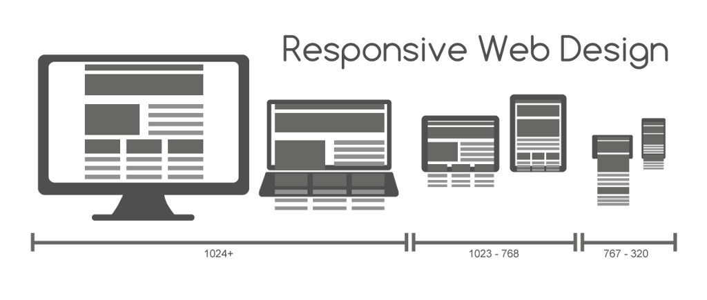
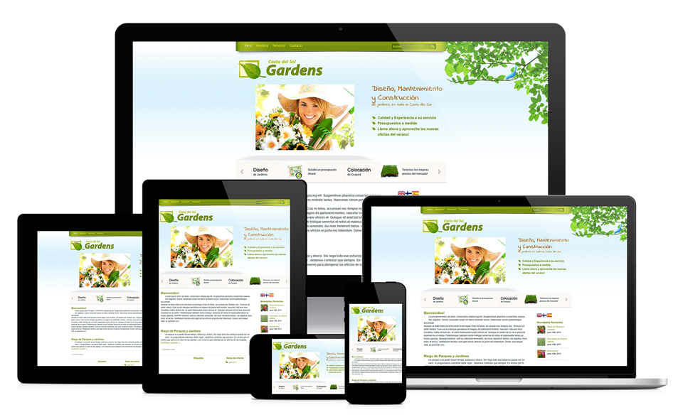
Responsive design is an approach that suggests that website design and development responds to a user’s behaviour and environment based on screen size, platform and orientation. This ensures content will look good and be easy to use across multiple devices, such as desktops, tablets, or smartphones, using flexible grids and layouts.
Nowadays, search engines take responsive design into consideration within their algorithms, and if a site is mobile-friendly, it has the potential to rank better than other, non-mobile friendly sites. As a result, it’s become more important than ever to make sure your website is setup responsively.
What this means for you is there are additional complexities to consider in terms of various devices and how users will view your site. Here are some key considerations to keep in mind.
It’s Different Than Desktop-only Design
You need to consider that viewers will be looking at your site differently depending on their device – that’s the whole point of responsive design. So while you may consider something that will look really unique and cool on desktop, how will that translate once someone is viewing what you’re trying to portray on a tablet, or on their even smaller mobile screen while browsing in bed? What used to be design that only had to take into account one version of the user experience, you must think more broadly and creatively to understand how you want to portray your content to your audience who now have access to your site on a multitude of devices.
And another thing to keep in mind is that just because your current site visitors are not generally on mobile (as seen in your Analytics), it’s not necessarily because they aren’t on the increase – it may be due to your current site being too difficult to use from mobile, and thus people leave the site immediately due to frustration, or else won’t visit at all from small devices. You may find your stats change once your site becomes easier to use.
Ensure Your Designer & Developer Understand Responsiveness
Some designers and developers are used to thinking about design within a single view only, from traditional print media to the websites of the past. When selecting a vendor to help you build your new website, make sure they really do understand all of the intricacies involved from design to development across the user device spectrum.
If they don’t, you’ll end up with a poor user experience, and a site that doesn’t work well on various devices, so you may have to go back to the drawing board or spend a lot of time and/or money redoing all or parts of it, getting it done the right way.
Choose the Right Images
There are a lot of possibilities to ensure that images are fluid and can work across different screen sizes. But you must keep in mind how an image may appear when it’s in full size on a desktop vs what can possibly show up within a smartphone, for example. Will you be able to see the details of that image once it shrinks down to a smaller size? When on a tablet vs a desktop, will parts of the image be cut off or not show what you ideally would like? For example, when sourcing out an image for that new blog post, think about what it’ll look like at various screen sizes, and not just what you are viewing when creating it.
Also keep in mind the size of images, and how it will affect loading times and performance across all possible devices, as this is another key ranking factor.
File Formats Across Devices
Another thing to think about is how video or other large files may be downloaded on a desktop vs a mobile-phone. For example, if you have a page with a looping video, you may want to make it show up as an image instead for mobile-devices, so as not to use up all of a person’s data if they’re not on a wifi network.
This also is a factor for other large file formats that you want to have show up on desktop, but not on smartphones. How will this change the user experience? What about performance? Will this still convey the message and action you are trying to get across?
Consider Mobile First
Mobile-first design was common prior to the uprise of responsive design and is recommended here as well. The idea is that when a page created, think first about how it would be viewed on mobile before determining how that could be enhanced to work on larger devices, like the desktop or tablet. It’s easier to scale up then scale down. Will you be able to read that headline on the smallest screens, and will the form need constant scrolling before it can be filled out and submitted? How does the navigation work?
This can also help the overall user experience since it will drive more simple, direct focus on the action that you are hoping for the visitor to take. Mobile users want fast-loading websites to research quickly, take an immediate action, or make a purchase while possibly on the go.
Summary
To summarize, when Implementing Responsive Website Design, key considerations include:
- It’s Different Than Desktop-Only Design
- Ensure Your Designer & Developer Understand Responsiveness
- Choose the Right Images
- File Formats Across Devices
- Consider Mobile First
Now that you understand more about what to think about when setting up your Responsive website, please check out our recent blog posts covering more useful marketing tips.
If you liked this video, subscribe to the Umami Marketing YouTube Channel and the monthly Digital Marketing Postcard. I’ll be back again in 2017, to answer more of your questions! Happy New Year!


![3 Copywriting Skills to 3x Results [Video]](https://umamimarketing.com/wp-content/uploads/2020/10/typewriter-720x341.jpg)